

By the Resource Geeks Networks Design Team, Bangalore. We have built products for Indian startups, D2C brands, and SaaS platforms since before “UX” became something people put in their LinkedIn headline.
A founder came to us once with a conversion problem. Good product, real users, healthy traffic. The app had a 71% drop-off right at add-to-cart. He was convinced it was a pricing issue. We spent thirty seconds on the screen and found it: the “Add to Cart” button was the same colour, same weight, and same size as the surrounding text. It did not look like a button. Users were not ignoring it. They genuinely could not tell it was interactive.
That is not a development failure. That is a UI UX design principles failure, and it was costing him real money every single day before anyone thought to look there.
This is what the field is actually about. Not aesthetics, not awards, not Dribbble portfolios. The invisible rules that decide whether a user moves forward or quietly disappears.
See how these principles sit inside the full picture: UI UX Design, The Complete Business Guide 2026
What Are UI UX Design Principles and Why They Matter
UI UX design principles are the rules behind how users perceive, navigate, and feel about digital products. They are not opinions. They come from cognitive psychology and decades of usability research, and they start working on your user before they have read a single word on your screen.
According to the UXness 2025 UX Design Statistics Report, 88% of users will not return after a single bad experience. That decision forms in under 50 milliseconds. The principles that govern those first moments are what this guide covers.
Understanding what separates UI principles from UX principles matters here too. UI governs how things look and behave on screen: colour, typography, button states, spacing. UX governs whether the flow makes sense, whether a user can complete a task without stopping to think. The best products apply both together. Separating them is how you get interfaces that look beautiful in a presentation and haemorrhage users in production.
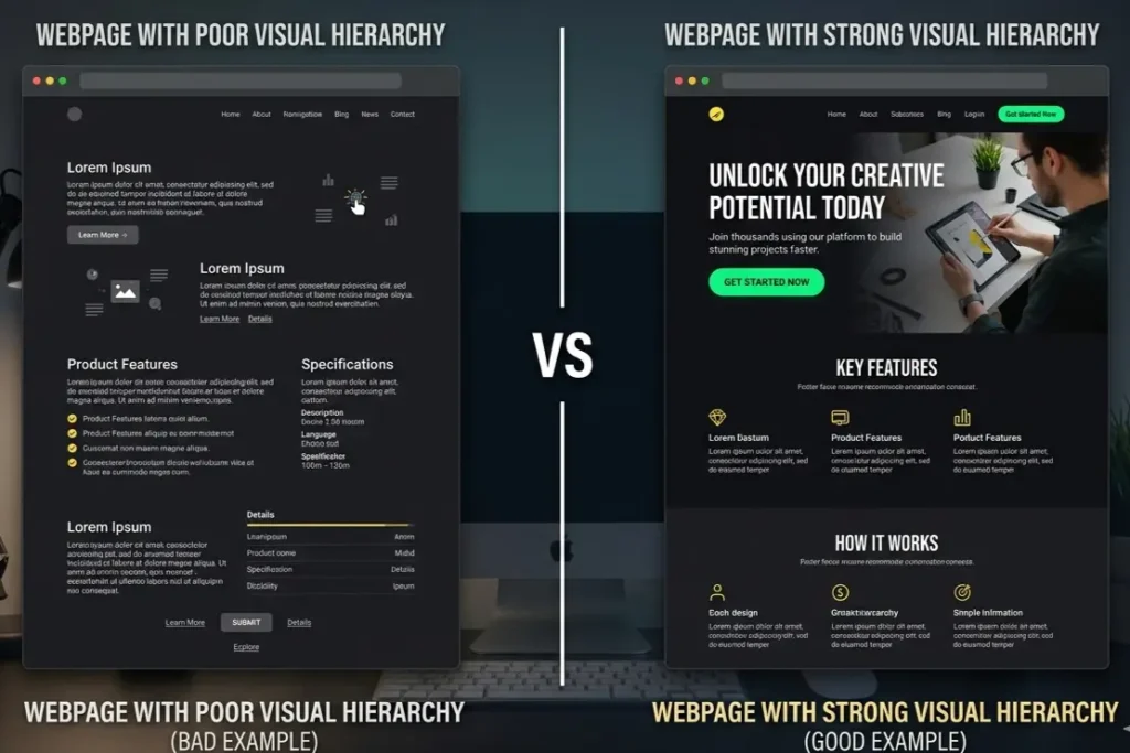
Principle 1: Visual Hierarchy
Humans do not read screens. They scan them. Eye-tracking research has confirmed this for twenty years and it still surprises people when we bring it up in a client meeting.
Visual hierarchy is the deliberate arrangement of elements to guide that scan. Size signals importance. Contrast earns attention. Spacing creates relationships. When the hierarchy is working, the user’s eye lands on the headline, registers the value proposition, and finds the CTA without any conscious decision being made. When it is absent, everything competes equally and users leave with a vague sense that something felt off.
The version of this we see most often in Indian product work is a landing page where the primary CTA button carries the same visual weight as the body copy around it. The team spent weeks on the writing. The button looks like a footnote. Users bounce.
Principle 2: Consistency
Nobody argues against consistency. Almost nobody actually delivers it.
Consistency in principles of good UX design is not about identical screens. It is about predictable behaviour. A primary button should look and act the same on screen seven as it did on screen one. Error states should follow the same format every time. Navigation patterns should not shift halfway through a flow without reason.
When consistency breaks, users rarely name the problem. They feel a vague unease, like something is slightly wrong. That unease reads as untrustworthiness. It is one of the quietest conversion killers in digital products, and it is almost always invisible in design reviews because each screen gets reviewed in isolation.
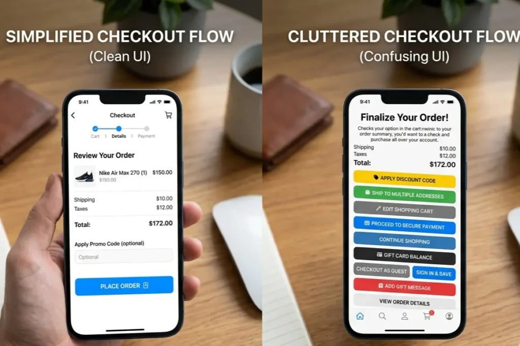
Principle 3: Hick’s Law
The more choices you give a user, the longer they take to decide. The longer they take, the more likely they are to do nothing at all.
That is Hick’s Law, and it is why the highest-converting flows we have built at Resource Geeks Networks almost always have fewer options than the client originally asked for. Menus cut from twelve items to five. Onboarding that asks for two things instead of eight. A landing page with one CTA instead of four.
The practical application is progressive disclosure: show users what they need for the current step and reveal complexity only after they have committed to going further. Which UX design principles do top companies use? This is one that every serious product team returns to, because removing options requires more confidence than adding them, and the results consistently justify it.
Principle 4: Fitts’s Law
Interaction time depends on two things: the size of a target and the distance to it. A small button in the top-right corner of a phone screen will always underperform the same button at the bottom centre. This is not a preference. It is physics applied to fingers.
UI UX design principles for mobile apps grounded in Fitts’s Law mean one thing in practice: primary actions go where thumbs rest naturally. Touch targets are sized for actual human fingers, not mouse cursors. The payment button does not live in a corner. The confirm action is not smaller than the product image next to it.
We work with a lot of D2C brands in India. The real question is never whether the product page looks good in a browser preview. It is whether the purchase action is reachable with one thumb on a mid-range Android held in one hand on the Metro at 9pm.
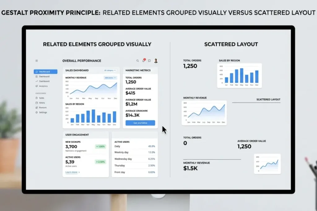
Principle 5: Gestalt Principles
The brain groups, organises, and finds patterns automatically, before any conscious thought. Gestalt psychology explains the mechanics of how.
Proximity tells users that elements placed close together belong together. Similarity signals connection between things that share visual characteristics. Continuity means the eye follows smooth paths without instruction. These are not design conventions someone invented. They are facts about how human perception works.
When a form groups its labels inconsistently, users have to stop and think. When a navigation menu is separated from the content it governs by too much space, the relationship breaks down. When cards on a dashboard vary randomly in size, hierarchy collapses. Gestalt is the difference between an interface users read effortlessly and one they have to decode on every visit.
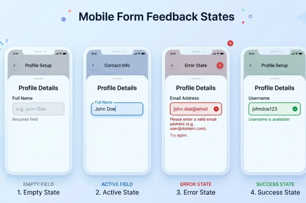
Principle 6: Feedback and Affordance
When a user taps a button and nothing visibly happens, doubt sets in immediately. They tap again. Or they leave. That silence is responsible for more abandoned flows than most product teams ever investigate.
Affordance means an element’s appearance should communicate its function without explanation. A button should look tappable. A text field should invite input. When affordances fail, users need to be taught how to use your product, and needing to teach them is already a failure.
Feedback is the response to every action: the loading indicator, the success message, the error explanation that tells a user what went wrong and what to do next rather than just turning a field red. The small animation confirming a tap registered is not decoration. It is the product telling a user it heard them.
See how these principles get applied during the actual build: The Real UI UX Design Process Agencies Follow in 2026
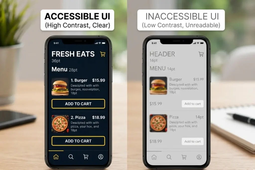
Principle 7: Accessibility
Most teams treat accessibility like a compliance task. Check the contrast ratio. Add the alt text. Ship it.
That framing misses the actual value entirely.
Accessibility as a core UI design fundamental means designing for how your users actually arrive: one hand, bright sunlight, second language, phone bought for under Rs. 10,000 with a cracked screen and 2G in a lift. In India, that is not a niche edge case. That is a significant portion of your users on any given day.
According to the UXness 2025 survey, 55% of UX professionals now name accessibility and inclusive design as a primary priority. The business case is not complicated. Colour contrast that works in direct sunlight works for every user. Navigation built for one thumb works for the commuter on a crowded platform. Copy written plainly for lower digital literacy reads better for everyone who is tired. Designing for constraints almost always produces better experiences for everyone.
Why These Principles Work Differently in Indian Products
Almost every global guide on user experience design rules was written for a Western user on a flagship phone with reliable WiFi. That user does not represent most of India’s 850 million digital users, and designing as if they do is an expensive assumption.
Trust signals work differently here. The hesitation points in a UPI payment flow are not the same as a Stripe checkout. Social proof carries more weight in Indian purchase decisions. Mid-range Android on variable 4G is the default device context, not the exception. Regional language preferences affect how users read hierarchy and sequence on a screen.
When we apply these principles at Resource Geeks Networks, we are not adapting a Western framework. We are starting from the user who is actually there. The principles are universal. The application has to be specific.
How Do UI UX Design Principles Apply to Mobile Apps
Every principle becomes more constrained on mobile. That constraint makes applying them correctly more consequential, not less.
Visual hierarchy has to work on a smaller canvas with less room for error. Hick’s Law punishes complexity harder because mobile users abandon faster at every friction point. Fitts’s Law becomes immediately physical: every primary action needs to be within natural thumb reach on the device your actual users are holding.
The basic principles of UI UX design for beginners to internalise for mobile are one primary action per screen, touch targets sized for real fingers, visible feedback after every interaction, and navigation that does not require stretching. Those four things, applied consistently, eliminate most of the reasons users quietly stop using a product.
Thinking of a career in UI UX design? Read this first →
FAQs
What are UI UX design principles?
They are cognitive rules rooted in psychology and usability research that govern how users interact with and feel about digital products. They cover visual hierarchy, consistency, feedback, accessibility, and decision-making behaviour. They are not stylistic preferences. They determine whether a product is usable or not.
What are the basic principles of UI UX design for beginners?
Start with five: visual hierarchy to guide attention, consistency to build trust, feedback to confirm every action, simplicity to reduce cognitive load, and accessibility to design for the full range of how users show up. Master these before anything else.
How do UI UX design principles apply to mobile apps?
On mobile every principle operates under tighter constraints. Screens are smaller. Attention is shorter. One-handed use is common. UI UX design principles for mobile apps mean touch-friendly sizing, thumb-reachable primary actions, immediate visible feedback, and flows designed for users who are moving, distracted, and on variable connectivity.
One Last Thing
Your users will not tell you when the design is failing. They will close the app, forget about it, and open something else.
At Resource Geeks Networks, we apply these principles to real products with real user testing behind them. Not principles-as-decoration. Principles applied to the specific screen, the specific user, the specific device context where the drop-off is actually happening.
If your product is underperforming and you want to understand why, that conversation starts here.
Start a project with Resource Geeks Networks
Author: Resource Geeks Networks Design Team, Bangalore. A design and technology studio building websites, products, and digital systems for Indian businesses and global markets.