

We have worked with enough founders to know how this story usually goes.
Someone builds a product. It looks good. The dev team did everything right. It launches and within three weeks, the numbers are flat. Session time is low. Drop off is high. The product works. Nobody is using it.
The diagnosis is almost always the same. The UI UX design process was either skipped entirely or treated as something that happens after the real decisions are made. Research gets replaced with assumptions. Wireframes get skipped because there is a deadline. Testing gets pushed to after launch, which means it never really happens.
We have cleaned up enough of these situations at Resource Geeks Networks to know that the process is not optional. It is the product.
Why the Process Is the Product
Most people think of design as the layer that goes on top of a product. The colours, the fonts, the screens. That framing is the reason so many products look great and perform terribly.
Design is decisions. Every interaction a user has with your product is the result of a decision someone made, either deliberately or by default. A structured UX design workflow makes those decisions deliberately. Without it, you are leaving your product’s behaviour to chance.
Research published by UXness found that 88% of users will not return to a product after a single bad experience. That is not a design statistic. That is a business statistic. If you want a broader understanding of everything this process sits inside, get the full overview in our complete UI UX Design Guide.
Phase 1: Discovery and Research
Clients sometimes push back on this phase. No screens get made here. No progress feels visible. The invoice arrives and the deliverable is a document full of insights about people who have not used the product yet.
That discomfort is worth sitting with. Because this phase is where the product either gets a fighting chance or gets quietly set up to fail.
We talk to stakeholders first, then to real users. For Indian products, this step is more layered than most global guides let on. The way an Indian user thinks about a UPI payment flow is structurally different from how a Western user approaches a Stripe checkout. The trust signals are different. The hesitation points are different. The device being used is almost certainly different.
India has 850 million digital users. The majority of them are on mid range Android devices, on variable connectivity, often in their first or second language. Designing without accounting for that is designing for a user who does not exist.
This is the foundation the entire UI UX design process is built on. Skip it and every phase after becomes an exercise in fixing problems that did not need to exist.

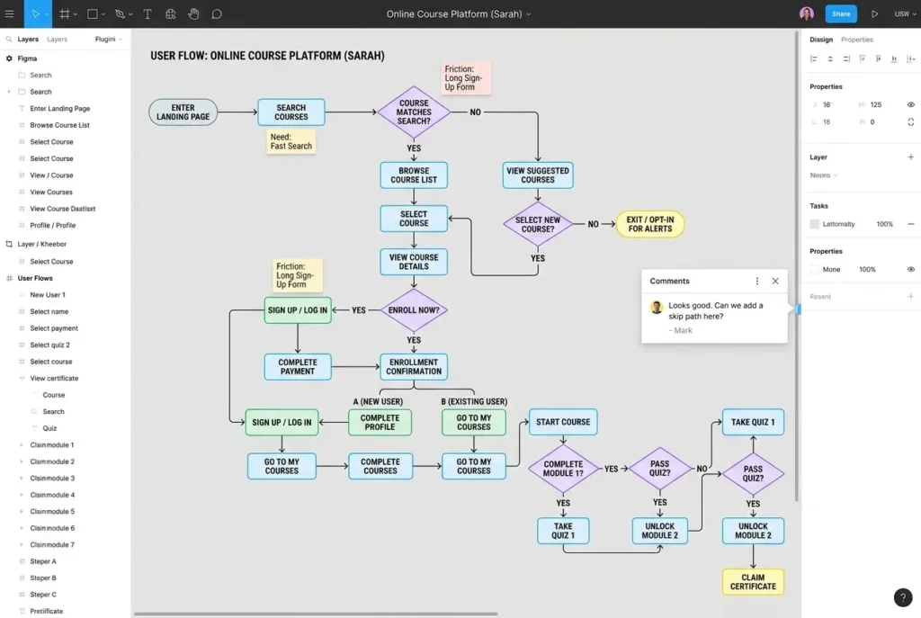
Phase 2: Information Architecture and User Flows
Before a single screen is designed, we figure out how the product is organised. What lives where. How a user gets from one place to another. Where the dead ends are before they become dead ends.
This phase produces a sitemap and a set of user flow diagrams. They look simple. They are not. These documents are what the entire team, designers, developers, product managers, align on before work begins. Getting this wrong creates the kind of structural problems that cannot be solved with better visuals.
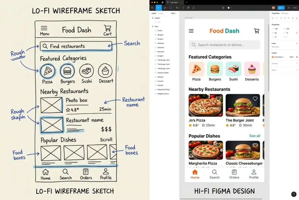
Phase 3: Wireframing
A wireframe is not a rough sketch you throw away. It is a structural decision made at the moment when changing it is still cheap.
We work in two stages here. Low fidelity first, which is fast and focused on layout logic. Then high fidelity, which brings in real content, actual spacing, and the hierarchy that makes a screen readable. Neither stage is about making things look good. Both stages are about making things work.
According to the UXness 2024 Annual Survey, 72% of UX professionals rely on Figma for wireframing and prototyping. We use it too. But the tool is not the point. The thinking behind the structure is.
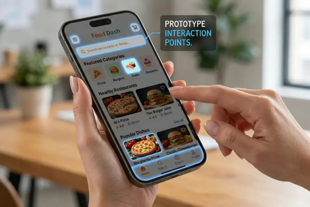
Phase 4: Prototyping and Micro Interactions
This is the phase where the product stops being a set of screens and starts behaving like a product.
We build clickable prototypes that simulate the real experience including the transitions, the feedback states, the micro interactions. That small animation when a form is submitted. The tap response on a button. The loading state between screens. These details feel minor until they are missing, at which point the product feels unfinished regardless of how much was built.
The practical argument for prototyping is straightforward. A problem caught here costs a few hours. The same problem caught after development costs weeks. If you want to go deeper on the toolkit behind this phase, see which tools we use at each phase of the design process.
For mobile specifically, this is where the step by step UI UX design process for mobile apps earns its value. Every gesture, every scroll behaviour, every transition gets validated here before a single line of code is written.
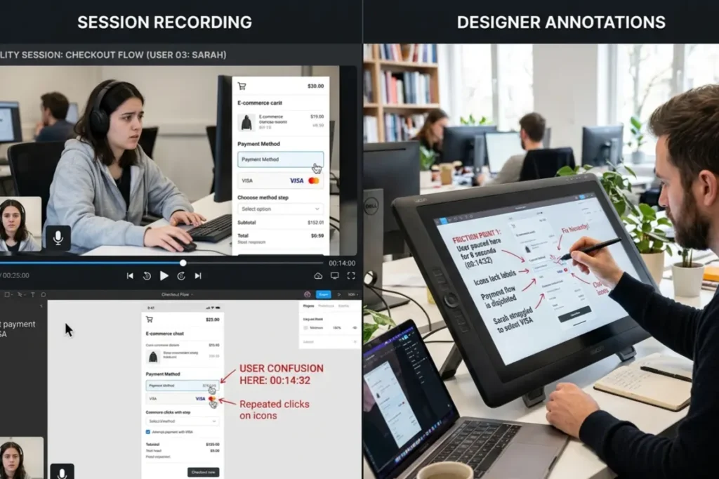
Phase 5: Usability Testing and Iteration
Every design we have ever delivered looked better after testing. Every single one.
This is not because the first version was bad. It is because real users interact with products in ways that nobody in a design meeting anticipates. They misread labels that seemed obvious. They skip the button everyone assumed they would press. They complete tasks using a path nobody planned for.
We run moderated sessions where a researcher watches a user move through the product in real time, and unmoderated tests where tools record exactly where users click, hesitate, and drop off. Everything is documented. Everything feeds back into the design.
Research from Procreator Design shows that companies investing 10% of their development budget in UX report an 83% increase in conversions. Most of that return comes from what gets caught and fixed before launch. To understand the thinking behind how we run these sessions, understand the design principles that guide every phase.
Iteration is not a sign that the design failed. It is proof the process is working.
Phase 6: Design Handoff to Developers
Here is where good work quietly falls apart for a lot of Indian startups.
The Figma file looks exactly right. The build does not. Buttons are slightly off. Spacing is inconsistent. That interaction that was central to the experience either did not make it through or got interpreted differently by three different developers.
The problem is never the tools. It is the absence of documentation that answers developer questions before they are asked. Our handoff includes annotated design files, a style guide, component specifications, interaction notes, and a design system that developers can reference throughout the build. This is how how UI UX design works when it is done properly. Not a file drop. A documented close.
If you want to see how we deliver this end to end, our UI UX Design service page covers everything we offer from first brief to final handoff. And once the design is ready, our Website Development team takes it through to a live, fully built product.
What This Costs in India
A landing page design engagement typically runs between Rs 15,000 and Rs 40,000 over one to two weeks. A full website project sits between Rs 50,000 and Rs 1,50,000 over three to six weeks. A mobile app going through all six phases properly ranges from Rs 1,50,000 to Rs 5,00,000 or more, depending on complexity, over six to twelve weeks.
Cheaper options exist. But the cost of skipping phases shows up in development rework, and that bill is consistently larger than the cost of doing the process right the first time.
The Gap Nobody Talks About
Almost every article written on the UI UX design process for startups in India is a Western guide with an Indian headline on it.
It does not account for mid range Android devices as the default, not the exception. It does not account for variable connectivity, regional language preferences, or the specific way Indian users evaluate trust before they convert. It does not account for UPI as the primary payment context, or the cultural weight of social proof in Indian product decisions.
When we work with Indian product teams, these are not edge cases we accommodate. They are constraints we start with.
FAQ
What is the UI UX design process?
The UI UX design process is a structured approach to building digital products that works through research, information architecture, wireframing, prototyping, usability testing, and developer handoff. Its purpose is to make sure every decision in the product is based on real user behaviour, not assumptions.
How long does the UI UX design process take?
A landing page takes one to two weeks. A website takes three to six weeks. A mobile app done properly takes six to twelve weeks. Cutting time by skipping research or testing creates problems downstream that cost more to fix than the time saved.
What are the steps in UI UX design?
The core steps in UI UX design are Discovery and Research, Information Architecture and User Flows, Wireframing, Prototyping, Usability Testing, and Design Handoff. The names change across agencies. The logic behind them does not.
Build Something That Actually Works
Bad products are rarely the result of bad engineering. They are the result of building the right thing for the wrong person, or the right person’s assumed version instead of their actual one.
At Resource Geeks Networks, the UX design workflow we follow is structured, transparent, and built around the realities of Indian users and Indian markets. Whether you are starting from scratch, planning a redesign, or trying to understand where your current product is losing people, we are ready to help.
Visit resourcegeeksnetworks.com to start a conversation. Free consultation, no commitment.