

The Indian D2C space is booming and it’s brutally competitive. Every rupee you spend on ads lands on one page. That page either sells, or it doesn’t.
If you’re a D2C founder building or redesigning your store, ecommerce product page design India is where your money is either made or wasted. Not on the homepage. Not on the about page. Right here, on the product page.
We’ve worked with Indian D2C brands across beauty, wellness, fashion, and lifestyle and the same problem shows up every time. The product page looks decent. It just doesn’t sell. This guide is about fixing that.
Why Indian D2C Product Pages Lose Sales
Here’s something nobody talks about honestly. According to a 2026 industry benchmark report by Mordor Intelligence, the India D2C ecommerce market is projected to hit Rs. 9.08 lakh crore by 2031 but Indian ecommerce conversion rates still trail the US and Europe, partly because of persistent trust barriers and COD return anxiety. Meanwhile, research shows only 49% of ecommerce sites deliver a good product detail page experience, which means fixing yours is one of the fastest ways to lift conversions without spending more on traffic.
That gap lives almost entirely on the product page.
We’ve watched founders pour Rs. 50,000 per month into Meta ads only to land users on a page that didn’t answer a single real question. The page looked fine, clean fonts, nice images, proper layout. But it felt like a catalog, not a conversation.
The ones who actually convert design their product pages like a sales rep who knows the customer’s objection before they ask it.
The five things that kill conversions consistently in Indian D2C stores are: no visible return policy, unclear delivery timelines, generic product images with no Indian context, a CTA button buried below the fold, and descriptions that list features instead of solving problems.
If two or three of those made you wince, you’re in the right place.
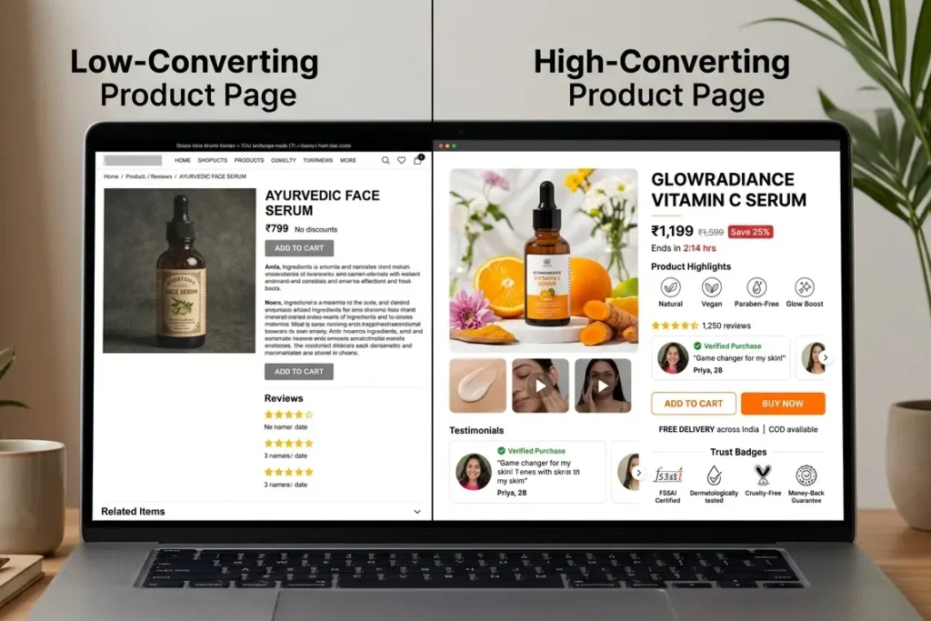
The Product Page Anatomy That Actually Works
Think of your product page as a physical store conversation. A good salesperson doesn’t shove the receipt in your face first. They greet you, show you the product, answer your questions, then close.
Your layout should follow that same flow.
Above the fold (what they see without scrolling): product name, price with any offer clearly shown, a short punchy benefit line, star rating and review count, and a high-visibility Add-to-Cart button. That’s it. No clutter. If a user has to scroll to find the price, you’ve already lost a significant chunk of mobile visitors.
Mid-section: product images and a short video, the actual description with benefits (not just specs), and 2 to 3 highlighted reviews.
Lower section: FAQs, detailed specs, shipping and returns, and cross-sell suggestions.
This isn’t a new idea, but it’s one that most Indian brands still get wrong, especially on mobile. The above-the-fold zone is sacred. Don’t waste it.
Hero Image Rules That Indian Shoppers Actually Respond To
Product imagery is the single most influential element on a product page. Research shows 67% of online shoppers cite image quality as the top factor in their buying decision, more than descriptions, reviews, or pricing.
But here’s what most global design blogs miss: Indian shoppers don’t respond the same way to generic studio photography. A fair-skinned model against a white background doesn’t signal “this is for me” to a buyer in Hyderabad or Lucknow.
What works in India specifically: real-life usage shots with relatable settings, multiple angles with at least one zoom-enabled close-up, a short 5 to 10 second product demo video (especially for fashion and skincare), and for fashion, sizing reference photos that show the product on different body types.
What kills conversions: over-filtered images where the actual colour is unrecognisable, single-image listings with no context, and stock visuals that could be from any brand anywhere in the world.
The combination that consistently works is one lifestyle shot in a relatable Indian setting, one clean product shot for clarity, and one use-case demo. This is also where product page design best practices meet cultural relevance. Global UX principles need local execution.

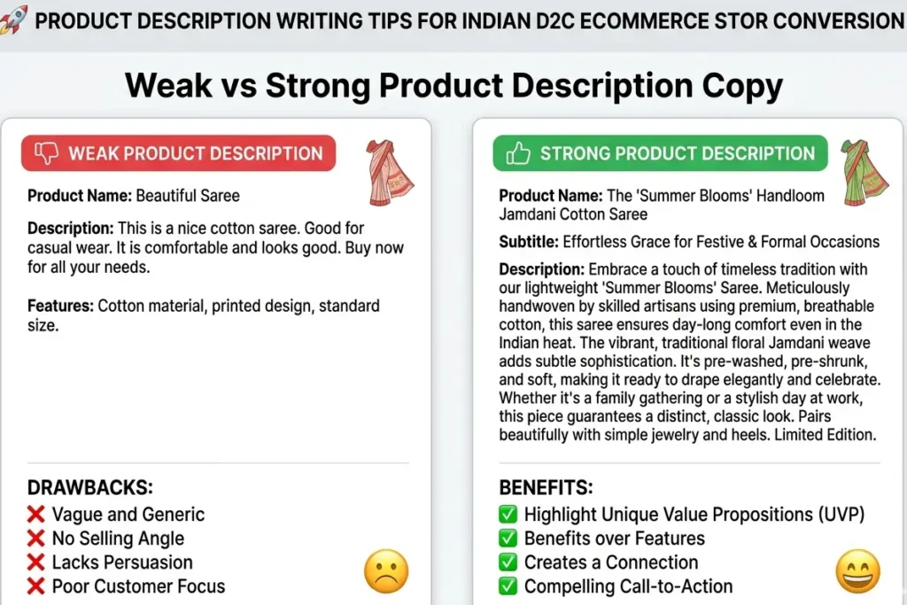
Writing Descriptions That Convert, Not Just Inform
This is where most brands are secretly losing sales without knowing it.
A description that says “100% cotton, breathable, machine washable” is not a sales tool. It’s a spec sheet. A description that says “Built for Indian summers, stays sweat-free even in peak humidity, washes easy, holds its shape after 50 washes” is a sales rep talking directly to the buyer’s lived experience.
The framework we use is Problem, then Solution, then Outcome. State the frustration the product solves, explain how it solves it, and paint the picture of life after buying it. Keep paragraphs to 2 to 3 lines. Use bullet points only for specs, not for the main benefit copy.
This is especially important if you want to rank for the keyword how to design product pages that convert India because Google’s AI Overview and ChatGPT search increasingly pull from pages that match the actual intent behind a search, not just pages that use the keyword.
How to Show Social Proof Without Looking Desperate
Indian buyers rely heavily on reviews. If your product pages don’t show customer testimonials, shoppers might go elsewhere to find them, which means you lose control of what they see.
But there’s a version of this that backfires: flooding the page with 47 five-star reviews that all look identical, or showing total review counts without surfacing the helpful ones.
What actually builds trust: show the overall star rating near the product title, surface 2 to 3 top reviews that include specifics (size ordered, whether it matched expectations, a photo), and if possible, include the buyer’s city. “Priya, Pune” feels real. “Verified Buyer” doesn’t.
Add filters like “Most Helpful” or “With Photos.” It signals that you have enough reviews to sort them, which itself builds confidence.
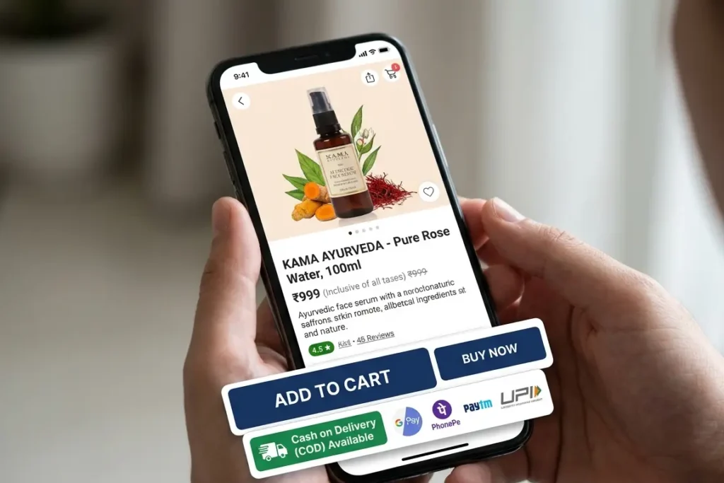
The Add-to-Cart Zone: Where the Money Lives
This section of the page is doing one job. Don’t distract it.
The CTA button, Add to Cart or Buy Now, should be visible without any scrolling on both mobile and desktop. On mobile, it should be sticky. The button colour needs contrast. If your site is predominantly white and navy, an orange or green CTA button will outperform a matching navy one every time.
Around the CTA, these elements matter specifically for Indian D2C: a “Cash on Delivery Available” badge (COD visibility can meaningfully lift conversions for first-time buyers), a delivery estimate with an actual date rather than a range, a stock urgency message if genuinely applicable (“Only 4 left”), and UPI payment logos to signal trusted payment options.
This is the core of d2c product page design tips shopify woocommerce. The platform decides the technical execution, but the principles don’t change. For a deep comparison of what Shopify and WooCommerce make possible here, we’ve covered this in detail in our Shopify vs WooCommerce India guide.
Mobile Product Page Design Rules
This isn’t optional in India. Over 80% of Indian ecommerce traffic comes from smartphones. Research from Shopify shows smartphones accounted for roughly 78% of retail site visits worldwide in Q3 2025 and generated about 70% of all online shopping orders. In India, that number skews even higher.
A mobile product page that doesn’t load within 3 seconds, has buttons too small to tap comfortably, or hides important information behind non-collapsible sections is a conversion problem, not a design preference.
Non-negotiables: sticky Add-to-Cart button at the bottom of the screen, thumb-friendly tap targets (minimum 44px), fast-loading compressed images (under 200KB per image), collapsible sections for specs and detailed info, and a single-column layout with no horizontal scrolling.
The concept of progressive disclosure works especially well here: show the essentials first, let users expand what they want. This respects both the attention span and the data plan of a buyer browsing from a mid-range Android in tier-2 India.
This is also why our ecommerce website development India approach starts with mobile performance before anything else. Speed and structure aren’t separate concerns. They’re the same concern.
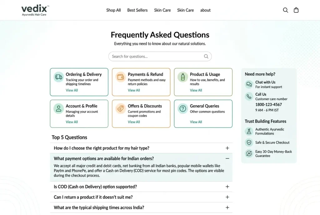
Sizing, Shipping, and Returns: The Trust Killers
One of the most underrated content gaps in competitor articles is that nobody talks about how you display this information, only that you should display it.
Here’s the reality from working with Indian D2C brands. COD preferences and trust barriers are real structural challenges, and the product page is where those trust barriers either get resolved or amplified.
For fashion: a visual size chart with actual measurements (not just S, M, L), a “What size are you?” recommendation tool if possible, and a return policy that’s visible near the CTA and not buried in the footer. “7-day easy returns, no questions asked” placed near the Add-to-Cart button handles more objections than any ad ever will.
For all categories: show the delivery estimate as a specific date (“Arrives by Friday, April 18”) and indicate whether the order qualifies for free shipping. “Free shipping above Rs. 499” shown clearly near the price can push the average order value while simultaneously reducing friction.
People Also Ask: Questions Indian Buyers Actually Type
Do product videos really help conversions? Yes, significantly. Research shows shoppers who watch product videos are 144% more likely to add a product to their cart. Even a 10-second demo video shot on a decent phone outperforms a static image gallery for most product categories.
How do I make my product page load faster in India? Compress images before uploading (tools like TinyPNG work well), use a CDN that has India-region servers, limit the number of third-party scripts on the page, and choose a hosting plan that doesn’t throttle speeds during peak hours. Both Shopify and WooCommerce have options here. Our ecommerce conversion rate optimisation guide covers the technical side in detail.
FAQs
What is the best product page layout for an Indian ecommerce store?
A layout that puts price, key benefit, ratings, and an Add-to-Cart button above the fold before any scrolling. On mobile, the CTA should be sticky. The mid-section should carry product images, a benefit-led description, and highlighted reviews. The bottom section handles FAQs, specs, and returns.
How do I improve my product page conversion rate in India?
Start with three things: make the CTA visible without scrolling, add “Cash on Delivery Available” near the price, and surface 2 to 3 real customer reviews with photos near the top of the page. These alone move the needle before any major redesign.
Should I show the return policy on the product page?
Yes, and it should be near the CTA and not just in the footer. Indian buyers, especially COD users, have high return anxiety. A visible “7-day easy returns” badge near the Add-to-Cart button directly reduces that friction.
What is the difference between this blog and the CRO guide?
Our ecommerce conversion rate optimisation guide covers the full funnel including checkout, cart abandonment, speed, and analytics. This blog focuses specifically on the product page level: layout, copy, imagery, and trust signals.
What makes a good product description for Indian buyers?
One that speaks to lived Indian experience, not global generic copy. Use the Problem, Solution, Outcome structure. Mention real context like summer heat, monsoon fabric care, and daily commute durability. Keep it short. Benefits before features.
Your Product Page Should Sell. Let’s Build One That Does.
Most product pages look okay. The ones that drive revenue are designed with intention, and every element earns its place.
At Resource Geeks Networks, we design ecommerce product pages built for Indian D2C brands, combining conversion psychology, mobile-first UX, and design that earns trust before the buyer even reads the description. We’ve done this for brands in beauty, wellness, fashion, and lifestyle. The work is in our projects.
If your product page isn’t converting the way your product deserves, let’s fix that.
